
Duration
6 weeks
What I did
UX research, UI design,
Prototyping, Usability testing
While we are creating our design system, we try to keep it clean and consider each of our components. I was responsible for creating the new table component, together with a coworker.
On the Nordnet website, data tables are used to organize and display the vast amount of trading data efficiently for our customers. They are everywhere, allowing customers to easily filter and sort the financial instruments they want to trade with, or are used to present other data, like buy or sell records.
Problems
Tables are inconsistent
When we reviewed the current table component, we realized that tables were inconsistent — they had an array of competing UX decisions and designs. The sizing, the placements of the data points, the colors on hover state, the filters, the sorting, the call-to-action buttons were all over the place.
Limiting features
When we interviewed a couple of product owners and traders, we also identified that there are many features that were requested from our customers that the existing table component could not support.
Messy code
Speaking with developers we also learned that the table components that were being used at that time were implemented differently everywhere. They required a lot of maintenance work for each page and updating them all at once was impossible.

Research
To fully understand the main purpose of the table component, we invited product owners, customer service, traders and developers to a workshop to understand what the user is trying to do with tables?
We eventually concluded that there are 5 main user goals:
-
-
- Browse a lot of information at once
- Compare results
- Quickly perform actions, such as: Removing multiples stocks from their watchlist or exporting multiple rows of data
- Filter and sort information
- Group information
-
This workshop also helped us came up with a list of features that had to be included within the table component.

Benchmarks
Before drawing any sketches, we also looked at how other design systems were tackling this component.

Exploration
& Ideation
The table is a very complex component, we divided it into smaller parts so each of us could investigate these components separately.
The different parts were:
-
- Header
- Toolbar
- Filters
- Label header
- Content
- Footer
I was in charge of the filters, toolbar and the content section of the table. For the content section, I first sketched out all the different ways a user could view as many data points as they wanted on each row. I then did intensive research and testing between my two best ideas, a scrollable table or a table with expandable rows.
Expandable table

Horizontal scrolling table

In the end, we settled with the expandable view. First, it’s more mobile friendly. The problem for the scrollable view is that users have a very small viewport for scrollable information in mobile view. Second, it allows users to evaluate additional information without losing their context. Users can easily toggle between the expanded area. Lastly, it’s easier for developers to implement because developers do not need to make sure mobile users can easily scroll horizontally and vertically.
I continued with a similar process of quick sketches, benchmarking, user testing, getting feedback from other designers and stakeholders to complete the remaining parts of the table.

Documentation
After doing all the ideations and exploration work, we have finally come up with a table component that will fit the needs of our website. We sat down together to write the technical and functional specification of the component. This will allow designers and developers to have a good understanding of how to use the table component in different scenarios.
1. Table Structure
2. General
3. Header
4. Toolbar
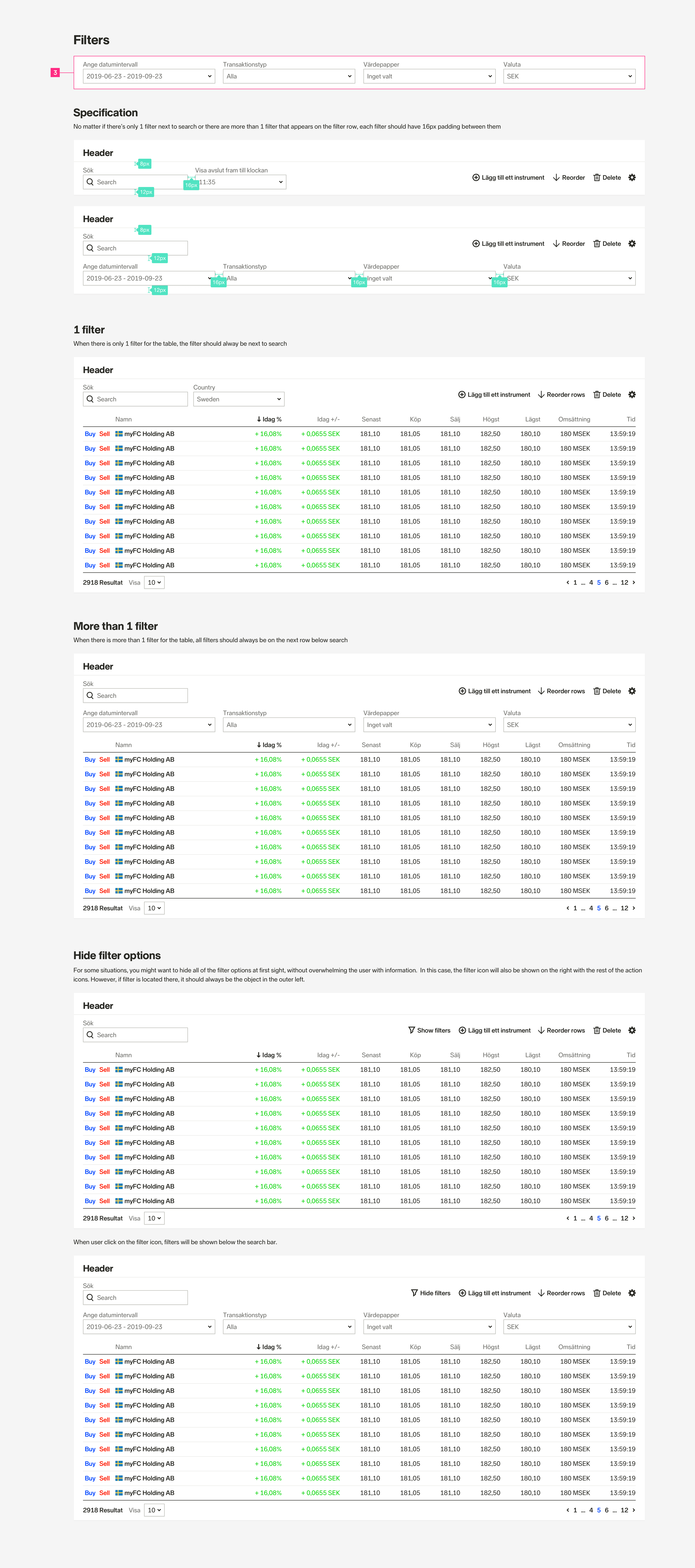
5. Filter
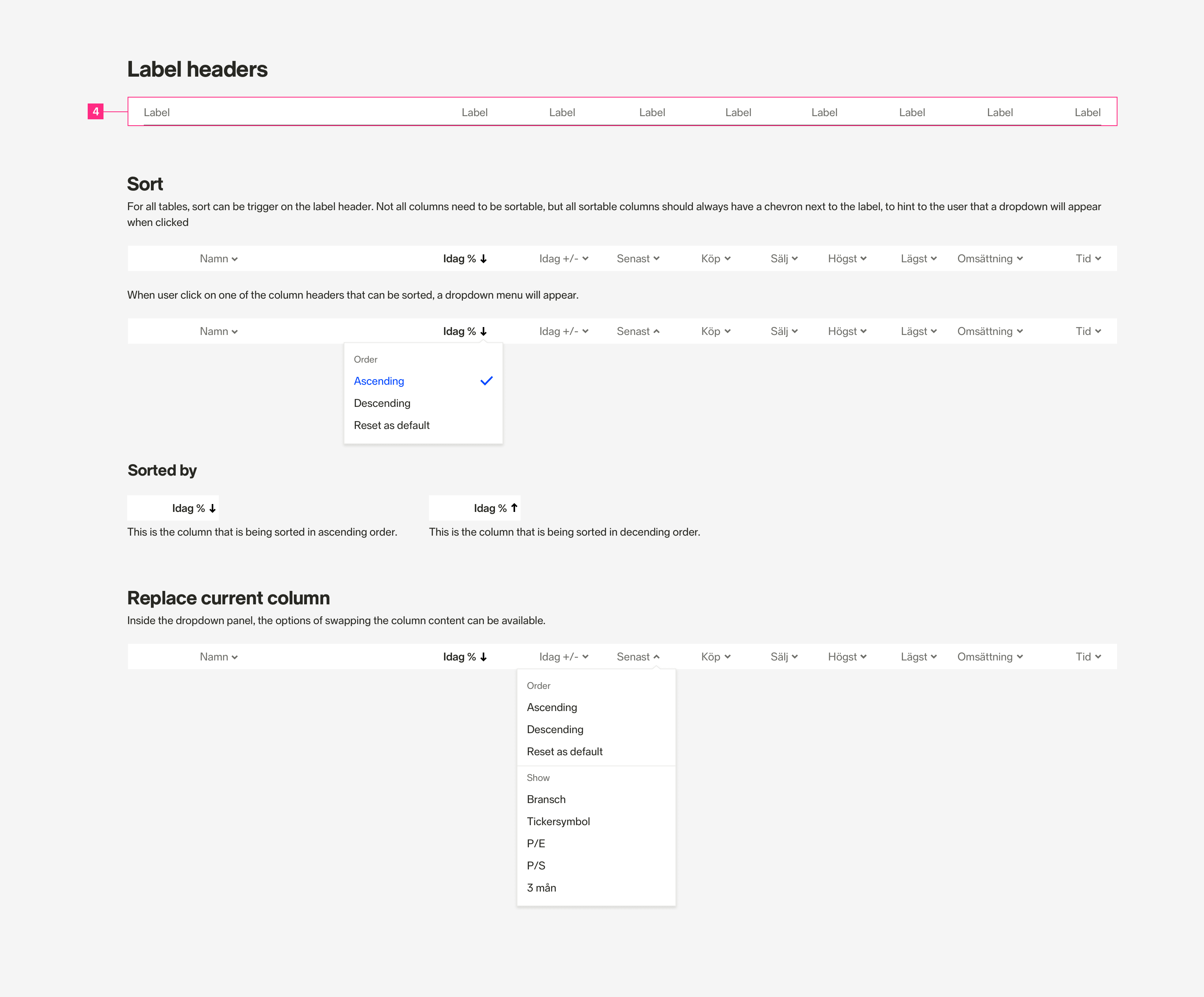
6. Labels Header
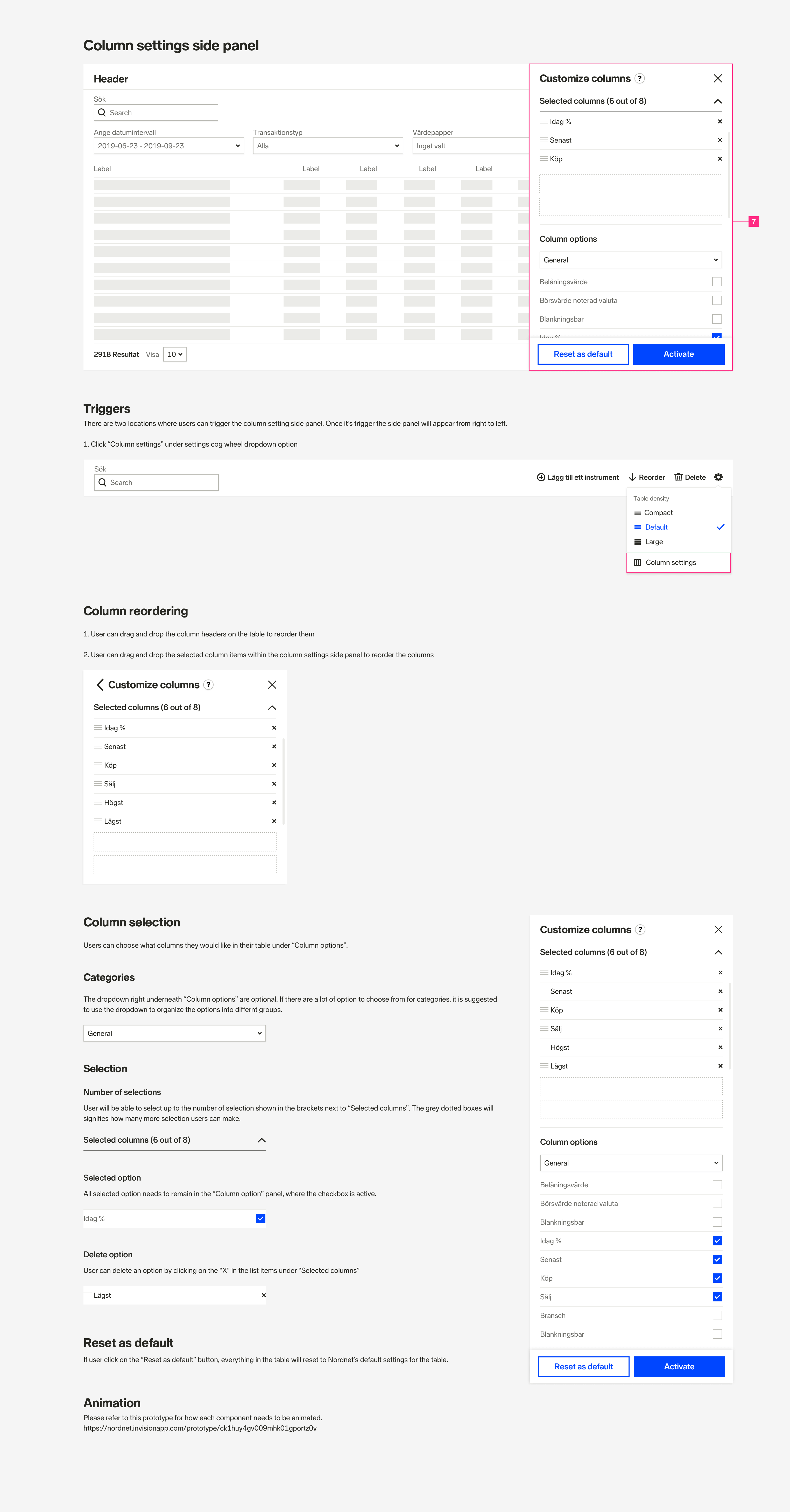
7. Column Settings
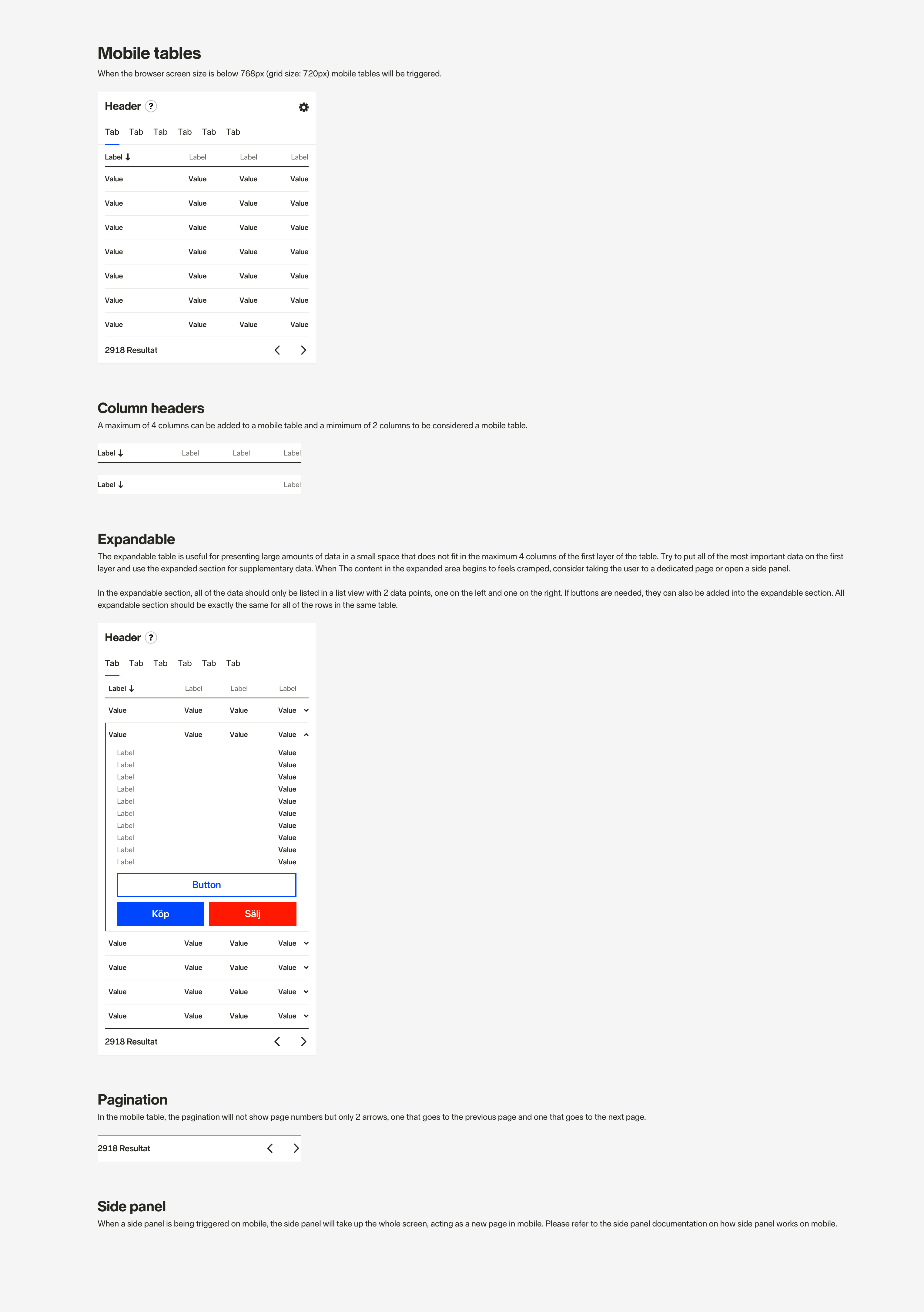
8. Mobile Table
Implementation
We worked with product owners and developers to divide the table components into an MVP and extending features. This allows developers to start building the basics of the data table, which is a much smaller scope to test and debug. We can also release the table component faster, where teams can start using the component in their new design and implementations, while new features are being added to the table component.
Outcome
The table was a really fun and challenging component to work on as it provides real value, involves a lot of research and detailed interaction work.
Some of the important takeaways I learned from designing this component were:
Breaking it down into smaller parts
Dividing the table into different parts, made the work easier and more efficient. This also allowed us to work on each section of the table in more detail
Document your decisions
The data table is complex. Documenting the specification and interaction details was really helpful to both me and the other designers. We can also come back to the documentation to remind ourselves how this component should be used.
Keep everyone in the loop
We involved all the stakeholders throughout the process, in order to get their opinions and requirements. This has made the table component a success where everyone’s needs were met at the end.